In today’s blogosphere, having high-quality content on your blog is an obvious necessity for success. The better the content on your blog, the more people will want to view it. What’s the use of having all of this amazing content, however, if it’s not easily accessible to the audience you’re trying to reach? Can your visitors find the information they’re looking for? Is your site’s look distracting them from the best your content has to offer? Is your site user-friendly?
Optimizing your blog to be user-friendly can make your content more easily accessible and enjoyable to consume, thus generating more traffic to your site. In this post, we’ll cover 12 of the best ways to make your blog more user-friendly in the modern age.
Embrace Minimalism
Getting rid of clutter and simplifying your website is important. It requires you to figure out what people really want when they visit your blog. If you’ve got too much happening on the page, it can make it difficult for the user to read and identify important content.
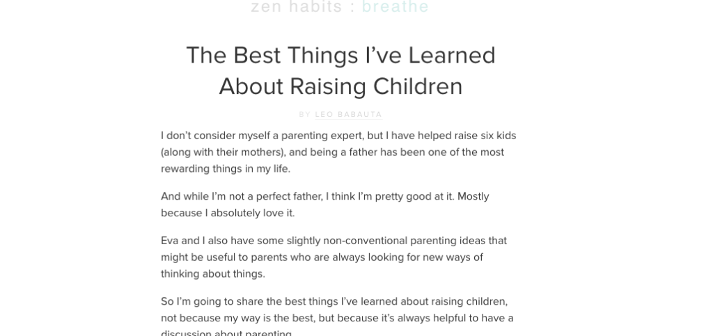
Don’t be afraid of a little whitespace. Keep the page simple and free of things that could distract from your content. No one likes to read a chaotic page filled with ads, blogrolls, and links to other sites taking up all the surrounding space. We aren’t asking you to turn your site into Zen Habits, but you get the drift.
Some online brands claim that removing the sidebar from the page completely can eliminate distractions for the viewer and improve conversion rates. It makes the words and images on your blog the one and only focus of the viewer’s attention.
If completely removing your sidebar sounds like a bit too much minimalism, it’s best to keep only the essential elements. Only include things that benefit the visitor. Having too many items in the sidebar can be an unwanted distraction to your readers.
Simplify the Navigation
The header and navigation section of your site should be a high priority when designing your blog. It’s the first thing the viewer will see when they land on each page and sets the tone for their experience.

Keep your header and navigation simple. The viewer doesn’t always need quick access to every other page of your blog. Cluttering the navigation can lead to a complicated system will drive away potential conversions.
Focus on your conversion goal. What do you want people to take away from your blog? What need do they have that your blog can fulfill? This should determine how you organize navigation. Do you want them to sign up for a mailing list, read your blog, or purchase a product? Focus on your goal and organize the navigation around it. Point them in the direction you want them to go.
Focus on the Font
There’s no excuse for your blog having tiny font. Nor is there any good reason for your blog to have a font with a harsh, unreadable color. It’s pretty simple, really. Small words are difficult to read. Having a larger font size will make your blog appear more accessible and help your content stand out.
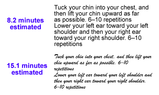
Clashing colors also make your blog difficult to read. Don’t use a font color that too sharply contrasts with the page’s background. A harsh contrast between background and font can hurt the reader’s eyes, causing them to click away, and losing you a potential conversion.
Optimize Load Times
The time of your viewers is valuable, and not to be wasted with long load times. The speed at which your blog pages load is a huge factor in determining whether a person will stay on your site or click away in frustration. If your load times are slow, you’re going to lose traffic and your site could fall in the search engine rankings.
Speed up your load times by minimizing your HTTP requests. An HTTP request is made for every image, stylesheet, script, and any other component that makes up your blog page. The more on-page components your page has, the longer it will take to load. Using a proper amount of minimalism on your blog should help your load times stay shorter.
You can also keep your load times fast by enabling browser caching. Use a caching plugin so that your blog doesn’t have to do an HTTP request every time someone revisits your page. When you visit a website, data from the page you visit is stored in a cache so that the browser can load the page without having to go through all the HTTP requests.
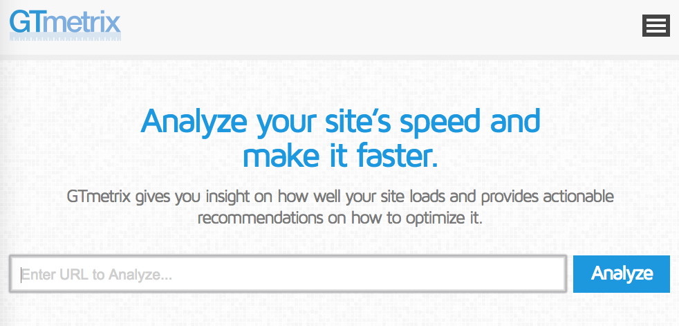
Sites like Pingdom Tools and GT Metrix are wonderful to assist with this.
Revamp the Theme
Does your blog’s design offer the best user experience possible? A good theme encourages site flow and guides the user’s eyes to the information they’re looking for. Design your theme so that it naturally leads the user to your conversion goal.
Perhaps your blog’s current theme has some issues that could be driving away potential conversions. Is it too minimal, or not minimal enough? Is everything clearly visible? Can the user find your calls to action? Sometimes your blog simply needs a theme redesign to offer the best user experience possible.
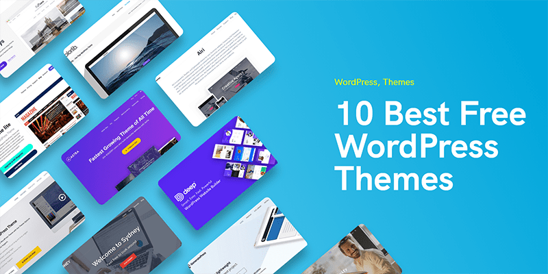
Looking for some great options? Check out our selected best themes for blogging in 2020.

Refine the Pop-ups
Most of us agree that pop-ups and slide-outs can be extremely annoying, especially when you’re hit with a barrage of them. Despite the seeming general disdain for obnoxious pop-ups, there’s actually nothing wrong with your site having one. When done correctly, in fact, they can be a useful tool in your blogging toolbox and increase your rate of conversion.
The important thing when including a pop-up or slide-out on your blog is to make sure that it doesn’t negatively affect user experience. Don’t go overboard with them. Remember, simpler is usually better. Set it to appear after about 15 seconds or use an exit intent pop-up that catches the attention of the user one last time before they click away.
Sharpen the Content
Content is the single biggest factor in determining the success of your blog. No one wants to visit a site with lackluster content. Even if you’ve already got amazing content, there is always room for improvement. Never slack on creating the best content possible for your blog.
Avoid long paragraphs. No one wants to be confronted with a wall of text. Keep text blocks short and easy on the eyes. Make sure you break the text up with relevant images, videos, and graphics to spice it up. Use tools like Grammarly and Hemingway to make things easier.
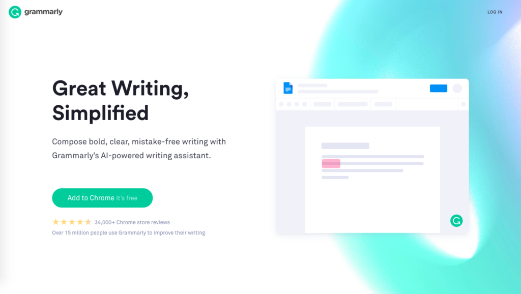
Don’t try to sound smart by using unnecessary and overly-complicated words. It puts people off and drives away traffic. Also, make sure all your spelling and grammar is perfect. You should also place links to other relevant sources or articles on your blog to drive traffic to those pages.
Use the Homepage
Creating a custom static homepage for your blog is a great way to showcase the content you want your visitors to see. This page will give you control over what the visitor sees, what message you’re sending to them, and creates a framework for honing your best SEO practices.
When creating a homepage, always put your best foot forward. Displaying your best content on this page makes for a good first impression by showing the visitor the best content you have to offer. This will increase the chance of conversion.
It’s a good idea to add a headline or short mission statement to tell visitors what type of content your site can offer to them. A very important part of any homepage is the Call to Action button. This button should be in clear view and should lead the visitor to your blog page. This minimizes the effort needed to visit your blog page and increases potential traffic.
Balance the Footer
Maybe you’re one of those bloggers who thinks the footer section is a waste of space. It’s a place reserved for mandatory privacy links and stuff you can’t squeeze anywhere else. Or, maybe you’re one of the bloggers who fills the footer section with as much extra content and links as you can to maximize the choices and information available to the visitor.
As with many things in life, the truth lies somewhere in the middle. Your footer shouldn’t be overcrowded. Remember: minimalism is key. It also shouldn’t be completely non-existent. Always include relevant links to social media, and maybe something important that could benefit your audience.

The footer is an excellent space to include one last Call to Action button. The visitor has scrolled through your entire blog post and has passed the comment section. You’ve given them the best you have to offer in content and design and they’ve completed the page. A properly-placed email opt-in button could be the final factor in their decision to subscribe.
Upgrade the Search Feature
A good search algorithm is a vital part of your SEO toolbox, especially if your blog has a lot of written content. Without a proper search feature, visitors will potentially have a harder time finding the parts of your content that they’re looking for. The more powerful the search algorithm, the more you can refine the parameters that will define the users’ search results. This will better allow you to get your best and most important content to the searcher.
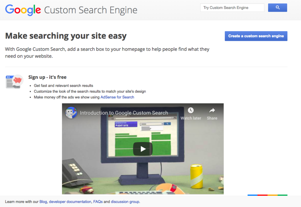
Google’s Custom Search Engine is an excellent tool that adds a custom Google search bar to your website. This will give you and the visitors to your site the benefits of Google’s one-of-a-kind search technology, such as autocomplete, the ability to promote pages within search, and refined search filtering. You can also adjust the size and color of your search bar to ensure that it matches the theme of your site.
Increase Security
Having your website hacked through a brute force attack is a real and terrible threat to your business. Thousands of sites are hacked every day and yours could be next. There are, of course, several ways to beef up the security of your site to prevent potential brute force attacks.
Security starts right with your computer. Having good internet security installed is a must if you want a strong first defense against attacks. Avoid saving important passwords on cloud sites or email and never leave passwords to your accounts left unprotected on your hard drive.
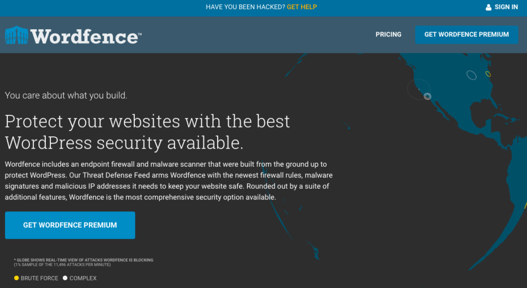
Make sure you’re using trusted plugins and a well-coded theme for your site. Keep the number of plugins to a necessary minimum and always make sure they stay up to date. Wordfence is one of the most commonly used security plugins for WordPress.
At the end of the day, it’s always best to have a backup plan. If the worst should happen, say your blog undergoes a brute force attack and you lose everything, having your blog backed up could save your site and your business.
Be Mobile Friendly
The modern age of the internet is mobile. If your blog isn’t optimized for mobile view, you’re hindering your potential for a higher conversion rate. Smartphone usage has become a major source of traffic to the blogosphere, and you simply won’t be able to keep up without making sure your site is mobile friendly.
You have several options when customizing your blog for mobile use. You could build an entirely separate version of your site for mobile use, you could use a theme primarily optimized for mobile access, or you could build a responsive design that adjusts automatically to the display of each device. Each option has its pros and cons, but Google generally recommends sites use a responsive design.
A responsive blog design allows for a pleasurable viewing experience on both desktop and mobile while only requiring that you edit a single site. This saves a lot of work compared to building a completely separate site for mobile use, which is generally the more cost-effective alternative.
Ready to Be User-Friendly?
Even if you already believe that your blog is top-notch, a good blogger knows that there’s always room for improvement. Use these tips to make your blog as user-friendly as possible, boost the potential traffic to your site, and increase your conversion rate. Make your blog, brand, and business boom.


