When you come across an interesting article from an unfamiliar blog, you may find yourself wondering “Who is behind this awesome article?” This is what you’d think before finding and clicking on their “About” page. Your click contributes to one of the most visited pages on many websites and blogs: The About Me page.
What Is an About Page?
Its title is self-explanatory. An effective About page does wonders for successful websites. It is a page that can be compelling, entertaining, informing, and all of the above. A powerful About page can have a serious impact on your website. So, what makes a successful About page successful? Simply answer the following 4 questions, just 4 steps, to get the ball rolling on your new and improved About page:
- What is the purpose of your blog?
- Who are you?
- Why does your blog benefit visitors?
- How will you draw in visitors?
1- What Is the Purpose of Your Blog?
The first thing you need to do is answer one question: why should your visitors pay attention? What’s the reason your visitors should stick around? This is the best way to grab their attention. If they don’t immediately see a reason, they’re likely to press the x-button at the top of their browser.
Starting your About page with your personal bio and history isn’t likely to keep visitors around. Yes, visitors are exploring your About page to learn more about your website, but in order to keep them around, you need to show how you can benefit them.
What is your blog intended for? Also, what services do you offer? What products do you sell?
These are the kind of questions you should answer at the beginning of your About page, in a short, concise manner.
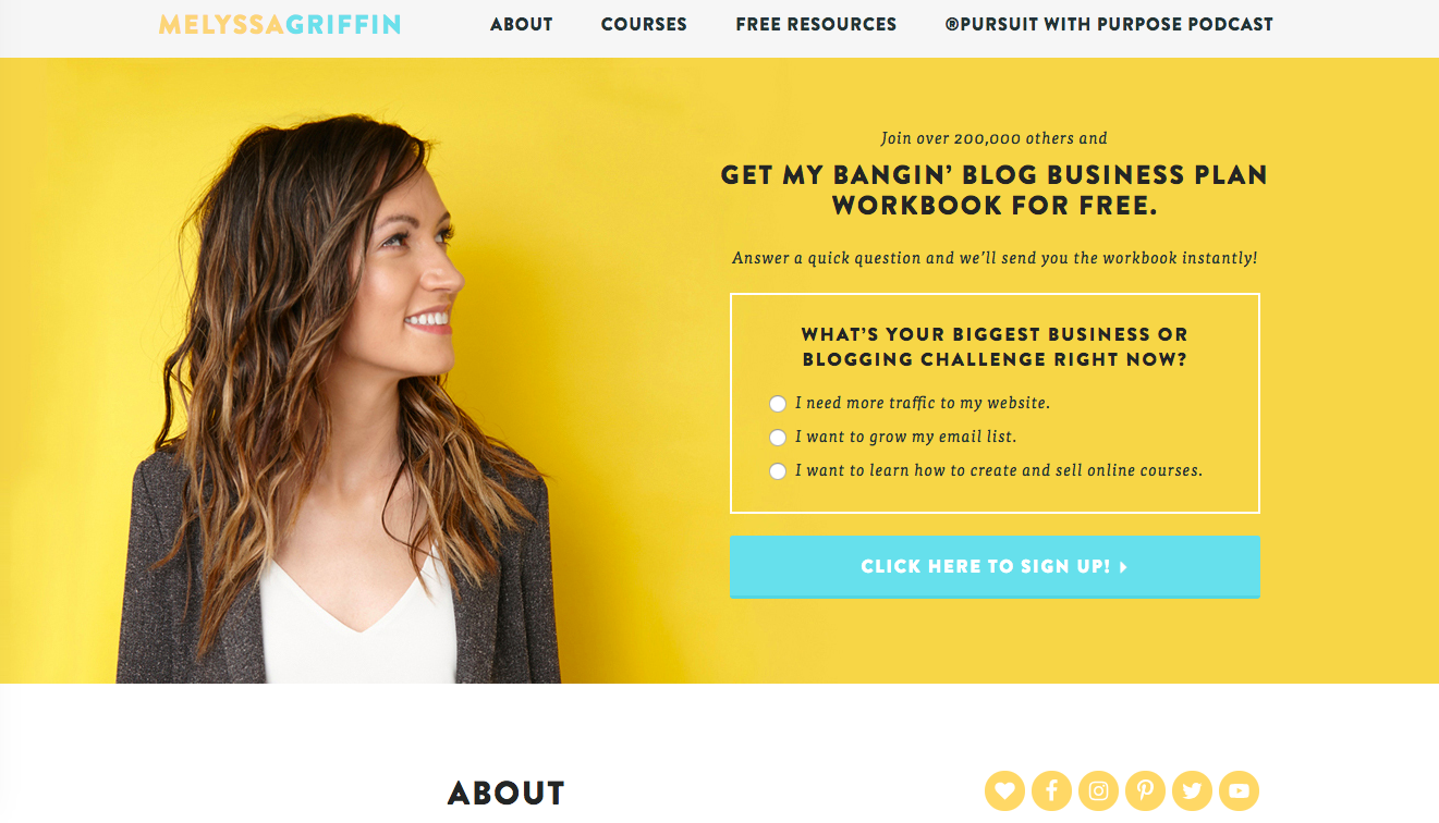
Next, directly state who your website is for. On Melyssa Griffin’s About page, she stated, “Launched in 2013 as a community for creative entrepreneurs, bloggers, and small biz rockstars, this site is a quickly growing collective of go-getters from all around the world.”
This single sentence tells us a lot about Melyssa’s website. It tells us when her website launched, who her website is for, and its current progress as a growing community in one concise, easy-to-read sentence. Display something like this at the start of your About page and you’ll be set.
While we will elaborate on this later, it is also important to consider adding short sentences that address the following: what will people get from your website’s content? What kind of content do you post? What kind of credibility do you hold? Again, these questions should be answered in no less than a few sentences, because we will go into detail later.
2- Who Are You?
Here is the fun part: your personal bio. This is where you, as a blogger or website owner, can share your story to the world.
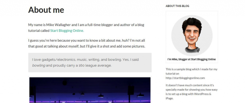
Everyone has a story to tell. And while some bloggers have a lot to say, you want to keep this part interesting and memorable instead of extensive. It’s best to keep most of the content of your bio tied to the content of your blog.
So, let’s talk about your backstory. What life events led to the establishment of your blog? How long have you been doing what you do? Have you had any interesting experiences in the context of your blog’s content? Tie these things together for a bio that’s relevant to what your blog has to offer.
Now, one of the main goals is to make your bio interesting. Some random facts or relatable information about yourself can truly make your About page fun to read. Talk about what city you reside in, your hobbies or what you do in your spare time, or anything else to help reach your audience. You just don’t want this to be the only content your visitors read.
At the end of your personal bio, you can also include some social proof and testimonials, if it ties into the end of your personal bio. Organizing them with bullet points or dashes is a great way to highlight information for visitors that are quickly scanning the page.
Lastly, an important tip: Do not forget a personal photo of yourself. This is a great way for your visitors to further connect with you and get an idea of who you are. When they can put a face to a name, or a brand, it adds memorability and provides vital exposure.
3- Why Does Your Blog Benefit Visitors?
After concisely introducing what you can offer your visitors, and telling them about yourself, you can elaborate on what your content entails. Your visitors now know, in a nutshell, what the purpose of your blog is, but this section allows for more details and information.
Expand on the ideas and content you previously mentioned. Explain to your audience:
- What you are here to do, and
- Why it benefits them
For example, if you are running a health and wellness blog, the absolute best way to keep your visitors and grow your community is to explain the benefits of your content.
- Do you post meal plans or tutorials that can improve their health?
- Or do you offer exercise tips?
- Do you maybe post tutorials that are easy for your visitors to follow?
Don’t hesitate to explain what you are doing and why you are doing it. Now that they know who you are, and your intentions with your blog, they’re more likely to stick around and follow your website or blog.
These first three steps (explaining the purpose of your blog, introducing yourself, and discussing why you can benefit them) are sure-fire ways to solidify the relationship you’ve built with new visitors. Now, all that is left is the fourth step.
4- How Will You Draw in Visitors?
This is where you will ultimately bring in followers. After you’ve caught the attention of your audience, you want them to stick around for more.
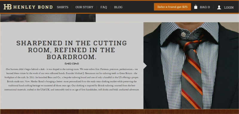
And how are they going to do that? It’s simple! You will wrap up your About page with a call to action.
A call to action encourages your visitors to step in and “take action.” This includes everything from following social media outlets, to opting in for e-mail notifications, to checking out your “getting started” page, to dropping a line and saying hello— your visitors are taking action and subscribing to more content! This will inevitably promote website growth and traffic.
You can include your call to action on various parts of your About page, like in your footer or your sidebar, but you always want to put it at the end of the page. You want to position it after step 3 so it “flows” and is easy to read.
Remember: the About page is a great place to tell your story and connect with your audience, but your About page is ultimately about them. Properly formatting your About page in a way that catches your visitor’s attention is crucial in gaining a following and site traffic. After answering these four questions, you will have successfully created optimal content for your About page.
“What is the purpose of your blog?”
“Who are you?”
“Why does your blog benefit visitors?”
“How will you draw in visitors?
About Page Design
Congrats! You’ve successfully typed up what you’re going to include in your About page. Now that you’ve produced content for this pivotal web page, you’re going to need to make your page appealing to the eye. Images, colors, and page format are some aspects of your page that visitors will immediately notice. If any part of it is unsettling or disorganized, it can discourage your visitors from sticking around. Here are some ways you can create a beautiful About page to go along with your top-notch bio.
Themes
If your blog is powered by WordPress, you can customize your About page with everything from shortcodes, to widgets, to templates. Modern websites (and their About pages) often use a classic row structure that covers the entirety of the page.
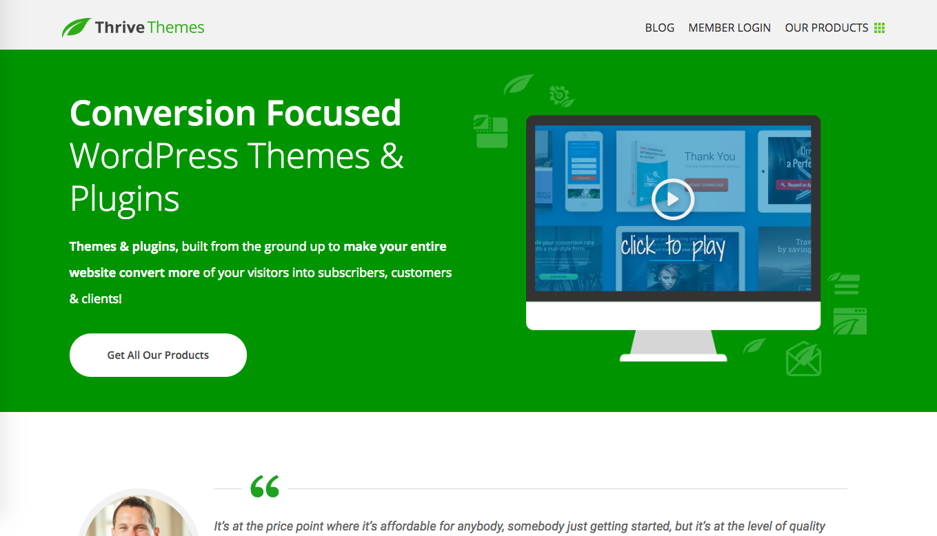
Since text remains in the middle of the page, this makes it easy for visitors to focus on. Explore the features of your theme to see what you can do to modify your About page. Thrive Themes offers a content builder to help bloggers create a top-quality About page. You can find more information on that content builder here.
Images
As stated earlier, putting images in your About page can take it from adequately arid to excellently engaging! Images are clear ways to show your audience who you are, what you do, and what your blog is about— no reading required!
Since photos are so important, you should choose clear and relevant images that are related to what you are discussing in your About page. This way, if your visitors are quickly scanning the page and not reading the text, your images can tell a story of their own.
Colors
Advertisers often use colors to reach their audience. Why? Because colors influence people! Research shows that colors have a strong psychological impact on people’s wellbeing, behavior, and decision-making skills, and this information is utilized by marketers and designers.
Consider this: Think of a fast food chain without the colors red or yellow in the logo. Hard, right?
These vibrant colors subconsciously make us hungry. Red is a high-energy color that is proven to increase appetite and heart rate, and yellow is an attention-grabbing color that’s associated with happiness. So, what happens when you combine the two? The urge to eat, and the urge to eat happily!
While these factors can go into your website’s general design, it’s important that they’re implemented in your About page as well. Going back to our previous example: If you run a health and wellness blog, some great colors to use in your About section are the colors green and blue. Green symbolizes growth, health, and environmental themes while blue represents tranquility, professionalism, and contemporary themes. You can use these colors in header titles, image borders, or when hovering over hyperlinks.
–
When building your awesome blog’s About page, you should carefully organize its text and its appearance. Telling your audience your blog’s purpose, who you are, and how it benefits them, and building a call to action, will successfully pull your visitors into your community. Additionally, an eye-catching appearance with fitting colors and clear images will tell a story before your visitors can read what you have to say, keeping them around for the entirety of your About page.
For more tips on building a top-quality About page, feel free to check out the tips and tricks below.
Additional Tips
Providing Social Proof
As stated earlier, testimonial posts through social media can help build credibility with your audience. If you have any positive feedback from customers or followers, don’t hesitate to post some of it on your About page.
However, these testimonials are established over time and with experience. Do not fake positive feedback, because it defeats the purpose of building honest credibility with your audience. Faking testimonials is more likely to harm you than help you.
Be Honest About Yourself (And What You Can Do)
When writing your personal bio, it is important to create an authentic image of yourself. If you portray yourself as something you’re not, it can harm you in the long run. You’ve probably already explained things like your experiences or parts of your life story, so be yourself and don’t be afraid to be original.
Additionally, be honest about what you can offer. Blowing up the extent of your services, or what you will provide your audience, can also harm your image and reputation.
Use Appropriate Colors in Your Design
Utilize the psychology of colors in your About page’s design. If you’re running a food blog, the colors red, orange, and yellow are warm and enticing colors that can have a significant psychological effect on your audience. Another warm color you can use is pink, which symbolizes sweetness and playfulness.
If you manage a beauty blog, incorporate purple for its association with imagination and luxury. It’s the quintessential color of royalty, after all.


